COVID-19 Interactive Analytics Power BI Dashboard
End-to-end Power BI dashboard providing interactive insights into global and regional COVID-19 trends, including confirmed cases, deaths, recoveries, and temporal evolution of the pandemic.
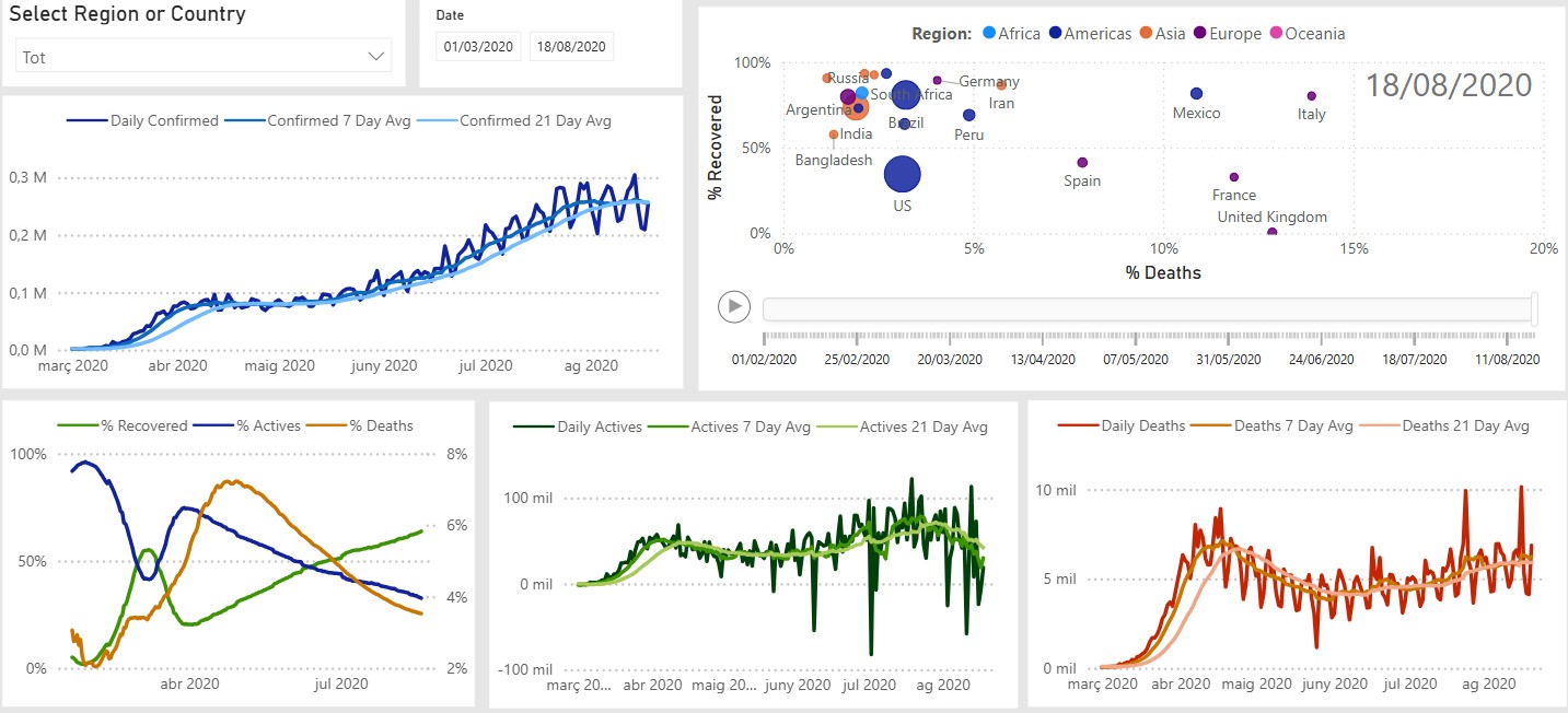
Problem
During the early pandemic period, publicly available COVID-19 datasets were highly fragmented, difficult to interpret, and lacked a unified analytical view. Analysts and general users needed a clear and interactive way to understand the impact of the virus across countries and over time.
Solution
Designed a Power BI report that combines publicly available COVID-19 datasets, transforms them into a clean data model, and visualizes key indicators with dynamic filtering. Implemented trend lines, geographic heatmaps, slicers, cumulative evolution charts, and comparison visuals to help users explore changes over time and between countries.
Impact
Provided a clear, accessible, and highly visual tool that helped users quickly understand pandemic evolution and compare impacts across regions. Reduced analysis time by centralizing all indicators into one intuitive report and made data more accessible for non-technical audiences.
Tech Stack Used
Key Challenges & Learnings
- Cleaning inconsistent global COVID-19 datasets from multiple sources
- Ensuring accurate cumulative calculations across time-series
- Handling missing values and country naming mismatches
- Building a responsive and performant data model with daily updates
- Improved practices for designing time-series dashboards in Power BI
- Strengthened skills in data modeling and DAX for cumulative metrics
- Learned techniques for optimizing complex visuals and large datasets
- Enhanced understanding of user-friendly BI design for public data
Screenshots