Bull Auction Comparison and Analytics Power BI Dashboard
Interactive Power BI dashboard created to compare bulls participating in an official auction, visualizing their morphology, carcass quality, reproductive traits, and growth indicators in an intuitive and structured way.
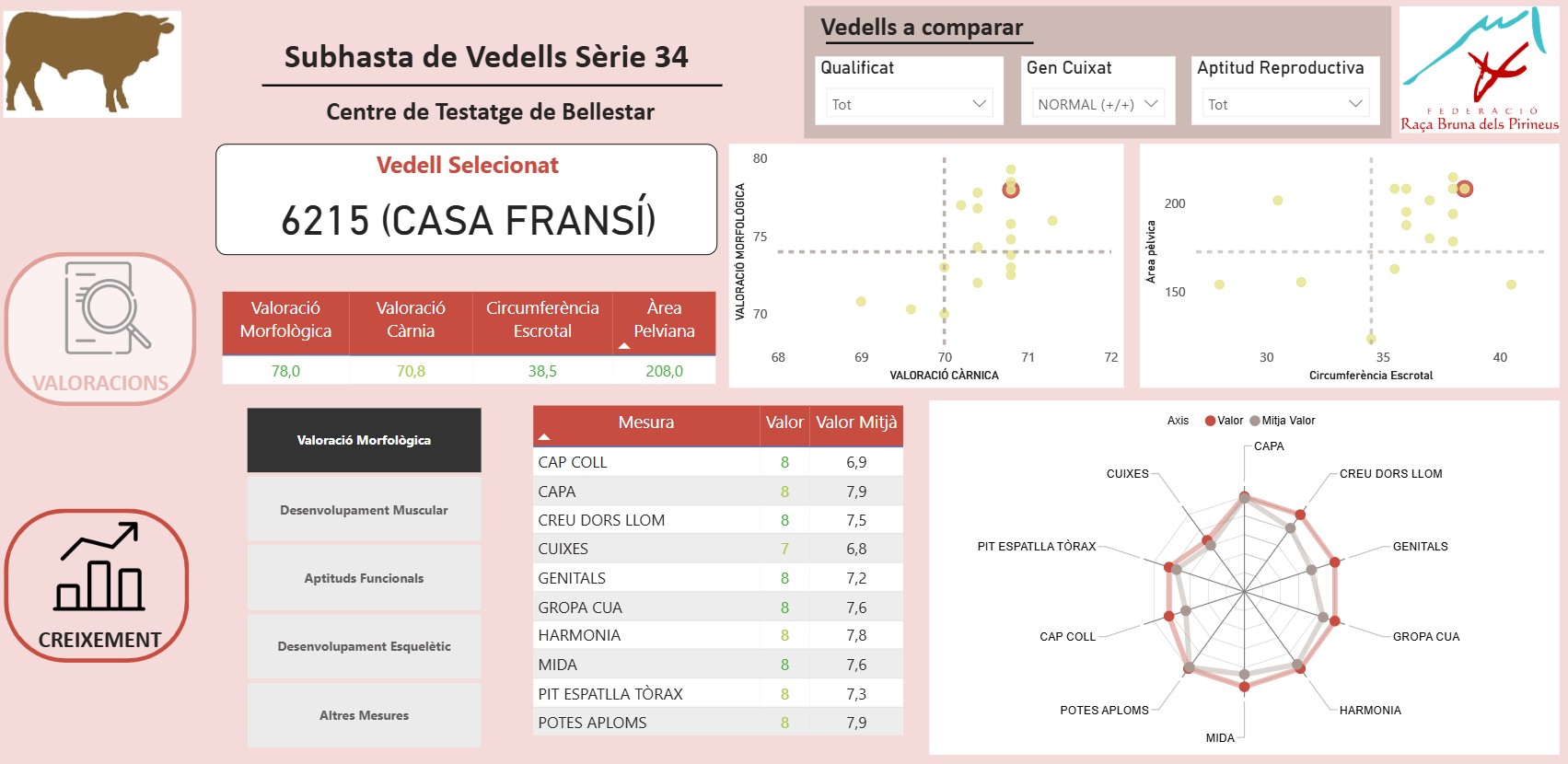
Problem
Cattle breeders and auction organizers needed a centralized and interactive tool to compare bulls objectively. Before this dashboard, data about morphology, carcass quality, genetic traits, and reproductive aptitude was scattered across spreadsheets, making evaluation slow and error-prone. Buyers lacked an easy way to compare animals side-by-side.
Solution
Designed a complete Power BI report that consolidates all bull characteristics into a clean, well-modeled dataset. Implemented comparison views, scatter plots, radar charts, and detailed trait breakdowns. Built slicers for genetics, reproductive aptitude, and qualification category to enable breeders to filter animals by specific needs. Added dynamic highlighting of the selected bull and average benchmarks to simplify evaluation.
Impact
Provided breeders and buyers with an accessible, transparent, and highly visual decision-support tool. The dashboard reduced evaluation time, improved fairness in selection, and made the auction more data-driven. Users can now identify top-performing bulls quickly, compare them against the group average, and assess strengths in morphology, carcass quality, and reproductive indicators.
Tech Stack Used
Key Challenges & Learnings
- Modeling complex morphology and carcass measures from heterogeneous sources
- Ensuring consistent scoring formats across different categories
- Building visuals that compare both individual values and group averages
- Designing a clean layout despite many metrics and biological traits
- Deepened understanding of how to model multi-category biological and morphological datasets
- Improved DAX practices for benchmark calculations and dynamic averages
- Learned advanced visualization techniques like dynamic scatter plots and radar charts
- Refined UI/UX design for agricultural and livestock analytics dashboards
Screenshots